Design challenge
Design a post log in section of the client web site aimed to help competent doctors streamlining and optimizing their online journey with an updated intuitive process designed on their needs.
A BIT OF CONTEXT
This was one month UX research and design project for a Soprasteria's client. The project is currently ongoing and held in Italian
Obiettivi di Progetto
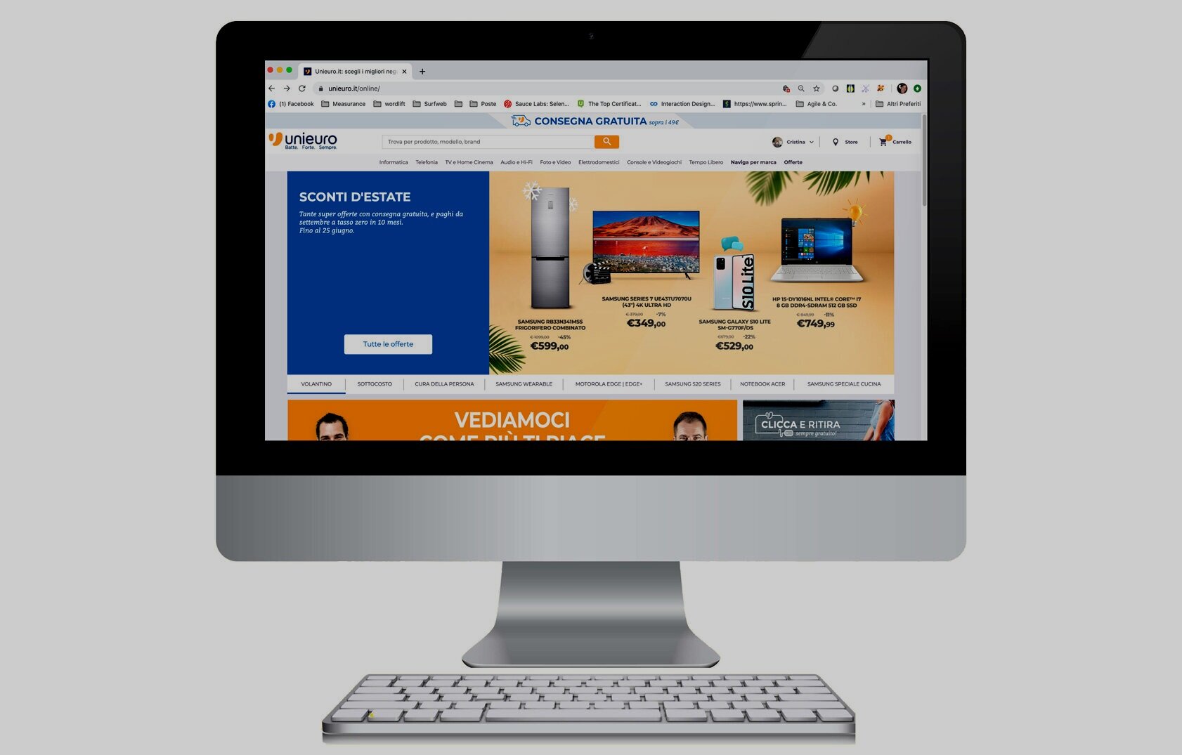
Cliente: National Institute for Insurance against Accidents at Work
Tipo di Progetto: ideazione e disegno delle funzionalità dell’interfaccia web per il medico competente relativa al Allegato 3A
Deliverables: risultati delle ricerche sugli utenti, architettura dell’informazione, prototipo interattivo aggiornato. Strumenti: Axure, Photoshop, Google Sheets e Power Point
In breve
I medici competenti al momento non possono usufruire dei benefici dei servizi on line offerti dalla digitalizzazione dell’ Allegato 3B in quanto devono riportare manualmente le informazioni necessarie.
Le attività di associazione dell’ unità produttiva è duplicata. Viene effettuata sia per l’allegato 3A che per l’allegato B.
Soluzione UX
Inserire nel portale, nella sezione del medico competente, delle funzionalità che permettano di poter usufruire dei vantaggi dell’ App «MEDICO COMPETENTE». Dare quindi la possibilità di aggiungere / aggiornare le informazioni dell’Unità Produttiva per l’allegato 3A
Queste informazioni insieme alle informazioni provenienti dall’app automaticamente aggiorneranno i dati necessarie all’allegato 3B, per il relativo anno di competenza.
RESEARCH
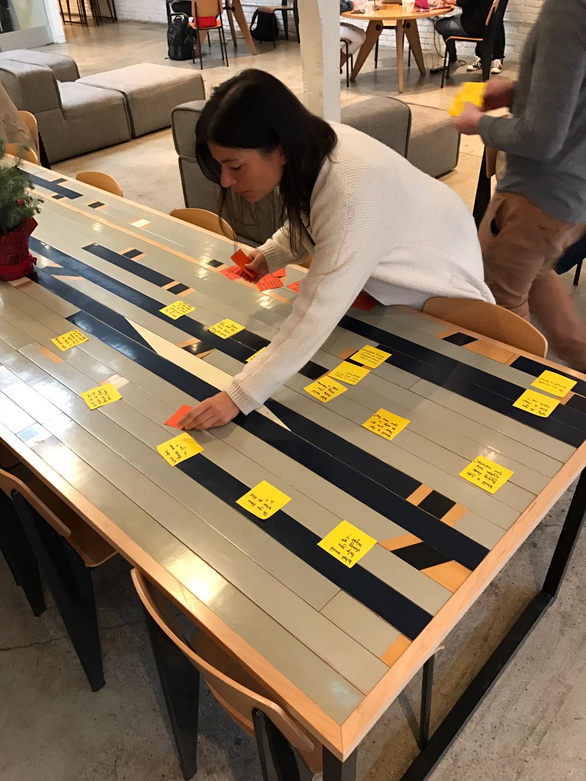
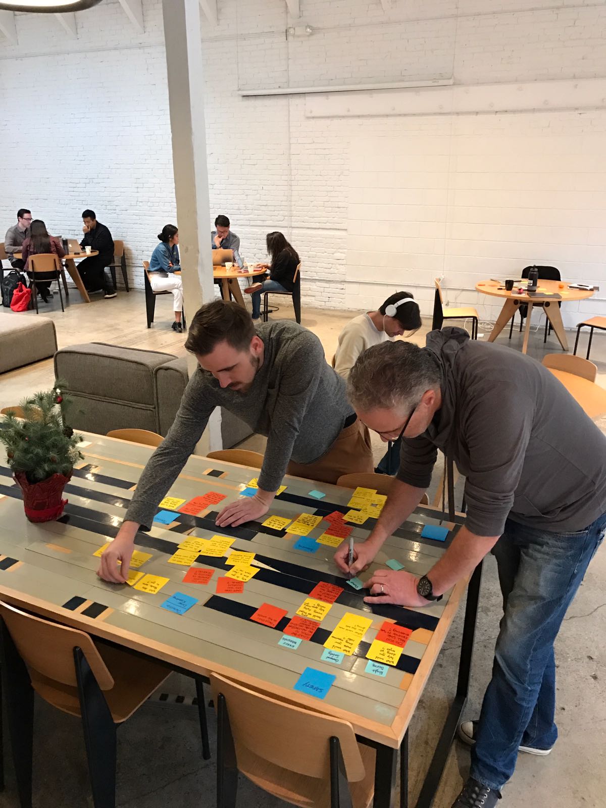
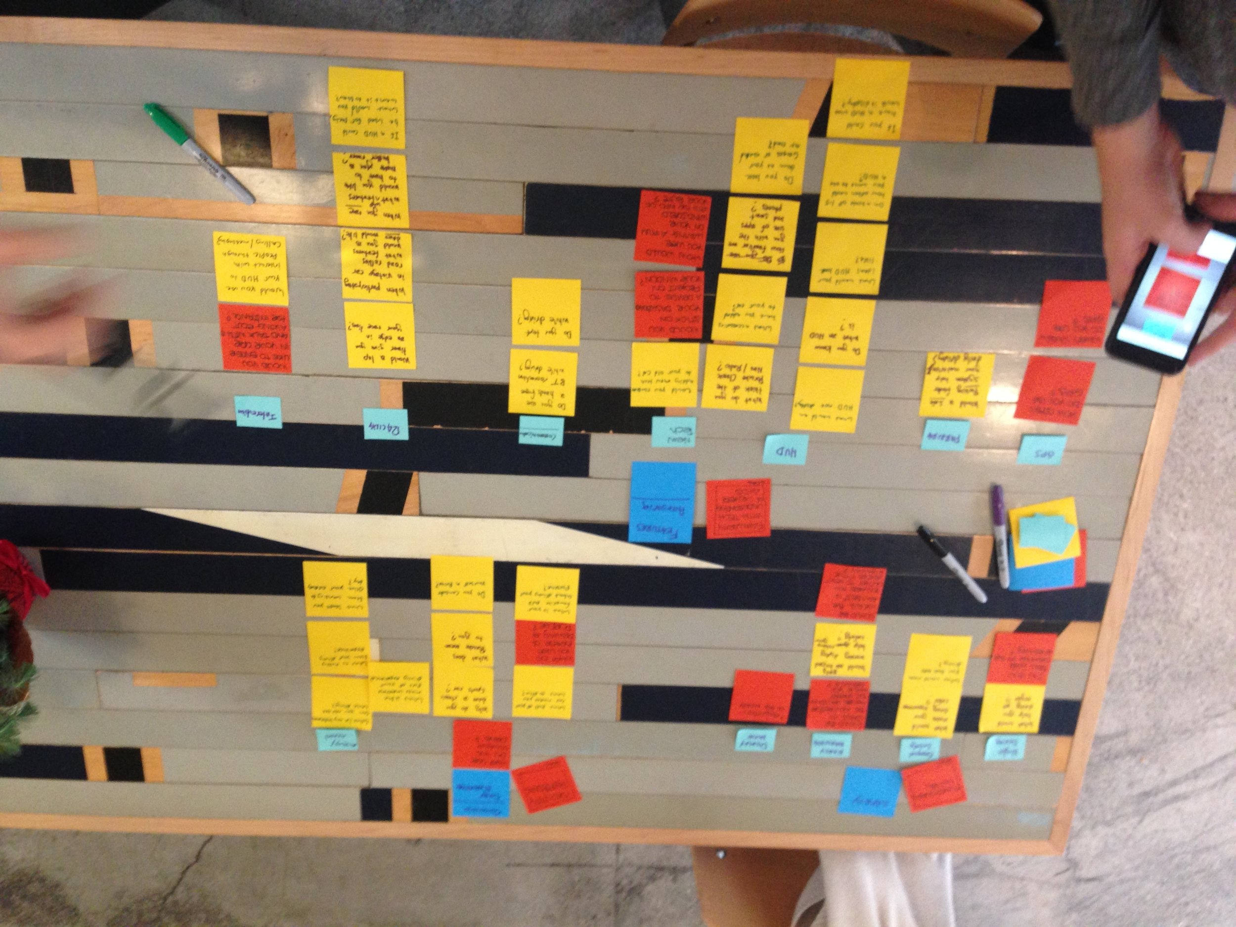
INTERVIEWS
We interviewed 10 people. We conducted the interviews face to face with people who live in Rome and In LoS Angeles.
Key take-aways: Most classic Porsche 911 owners are not interested in adding technology that requires modifying or distracting from the look and feel of the car.
”After market modifications are like dressing grandma in teenage clothing”
MARKET STUDY
CLASSIC PORSCHE MARKET

DRIVER ASSIST TECHNOLOGIES CURRENTLY AVAILABLE

Key take-aways:
The 911 model is the most diffused on the market.
All the 911 autos has a removable tachometer on the dash with the same shape and dimension. This could be replaced with a digital multifunctional display.
Current technologies allow to connect the camera and sensor via bluetooth
ANALYSIS
Personas
From the interview, we inferred that we had three categories of drivers that are strictly connected with their Porsches. We created three car/personas to represent them.

DESIGN
Design Studio

Key take-away: Designed two solutions that we validated then with user:
Replace the Analogical tachometer with a digital multifunction display
Create and app that can reflect either on a HUD display or on a display Windshield Film
WIREFRAME/ LOW FIDELITY

Wireframe medium fidelity
Heads Up Display (HUD)
Multifunction Display

USER TESTING
1.First iteration
We tested which display users would prefer, HUD or Multifunction
Guerrilla Testing
Users: Porsche owner
Location: Camarillo, CA
Date: Santa Barbara Porsche club breakfast
Scope: Display preferences and device positioning

Key take-aways: Users prefer embed a removable multifunctional display into their dash rather than have other invasive solutions
2. Second Iteration
Testing the functionality and features of the Multifunction Display
Lean UX Testing
Users: Drivers
Location: Santa Monica GA campus
Scope: User Interaction, features usability, learnability and memorability.

Key take-aways:
•Voice interaction with a optional physical click wheel is a must.
•Voice control activation name should be simple and easily pronounceable,
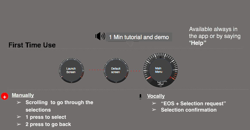
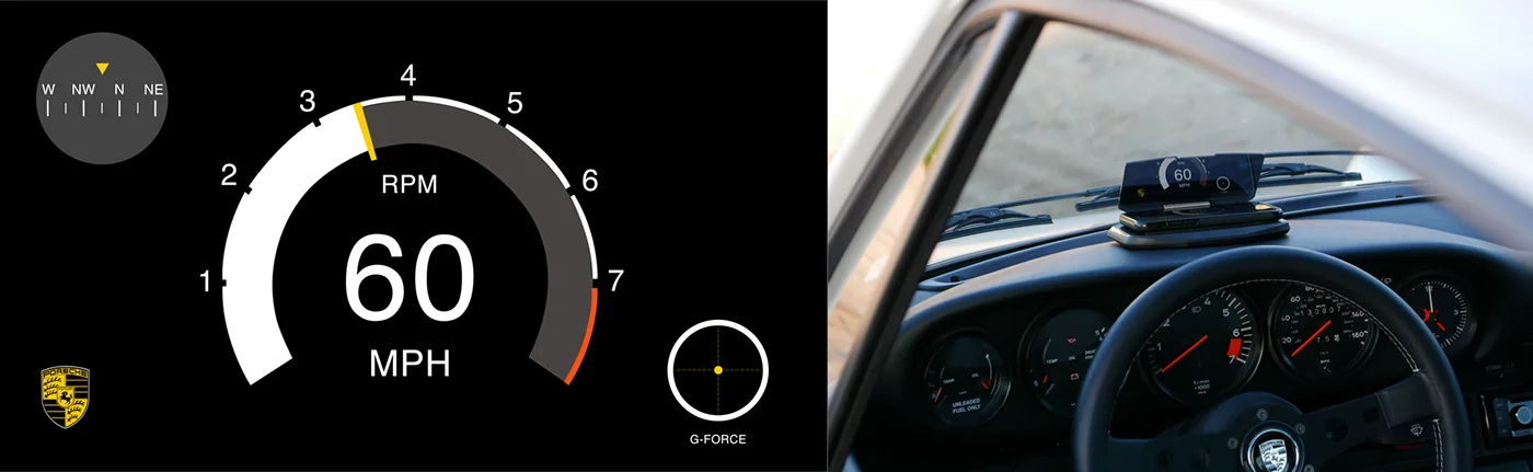
The solution
A multifunction display that replaces the central tachometer of all classic Porsche 911's. Landing screen matches the look of the original Porsche tachometer.

Key design elements:
Voice interaction + physical click wheel
Uses existing electronic connections: No modifications necessary
RPM always visible
Bluetooth connectivity with phone
Obstacle awareness + back-up camera
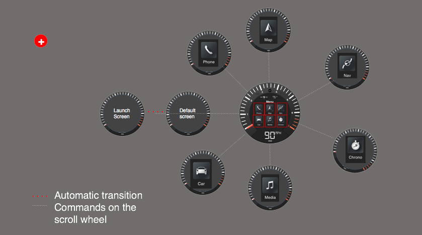
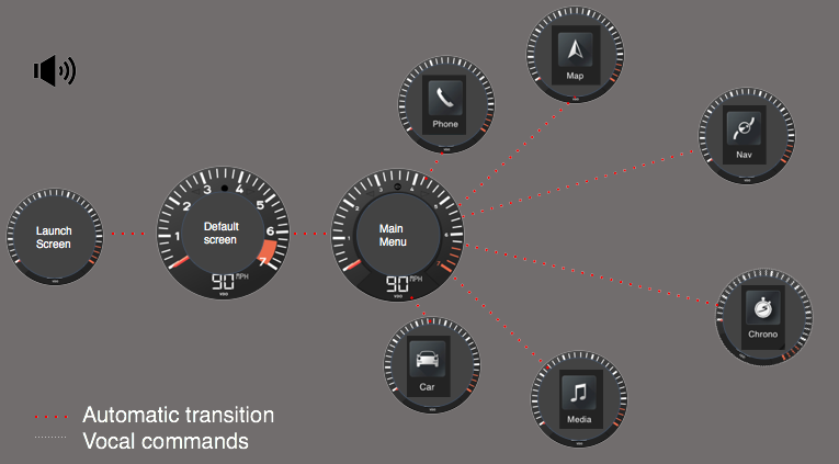
FINAL SCREENS
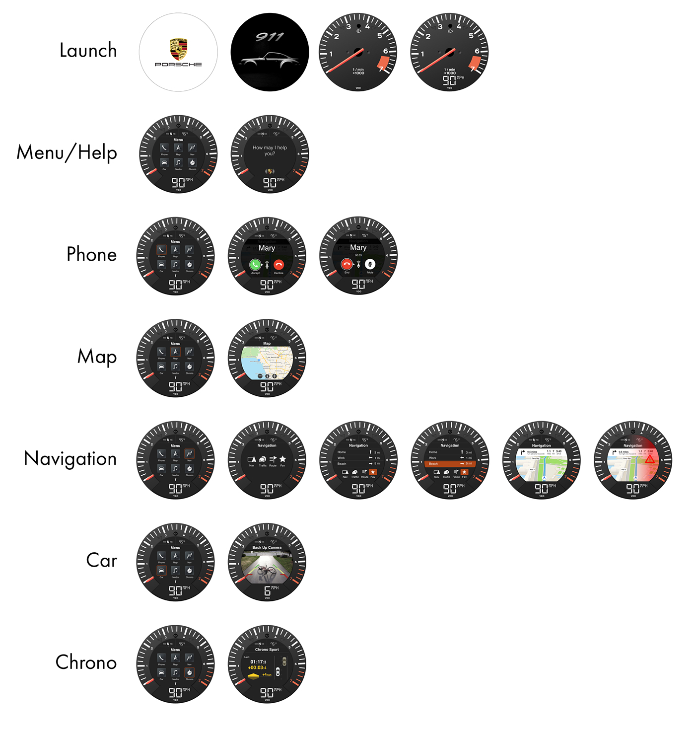
user flow
The interaction with vehicle can be either vocal or manual. From main menu is possible to access to all function or submenus.